Stakeholders often receive a KPI but still cannot see the pattern underneath it or know where to investigate next.
Power BI · Data Analytics
Power BI Dashboards
Data products designed around investigation rather than passive reporting. I combine data quality work, analytical reasoning and interface design so users can move from a headline KPI into the pattern underneath it without fighting the dashboard.
Independent case study · In progress
Meridian Advisory Group
When time is recorded but its commercial value is unclear.
A simulated consultancy with 5,000 employees, 240 projects and fragmented operational reporting. This case study follows the data from its raw, unreliable state through quality assurance and into decision ready analysis.
Read the case study5,000Employees
240Projects
25Validation rules
At a glance
Worked from data quality and baseline analysis into filter logic, information hierarchy, chart choice and drill paths so the report supports a decision rather than passive viewing.
Real downloadable PBIX artefacts are included. Where a business outcome cannot be evidenced publicly, I state the decision support intent instead of inventing impact.
Visual proof
See the interface before downloading the file.
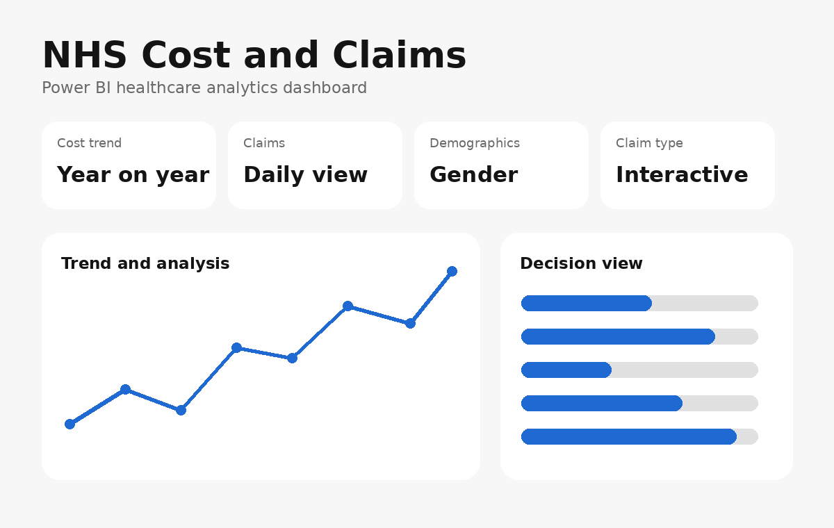
NHS dashboard preview: a decision first view that lets the user move from headline performance into the underlying pattern.
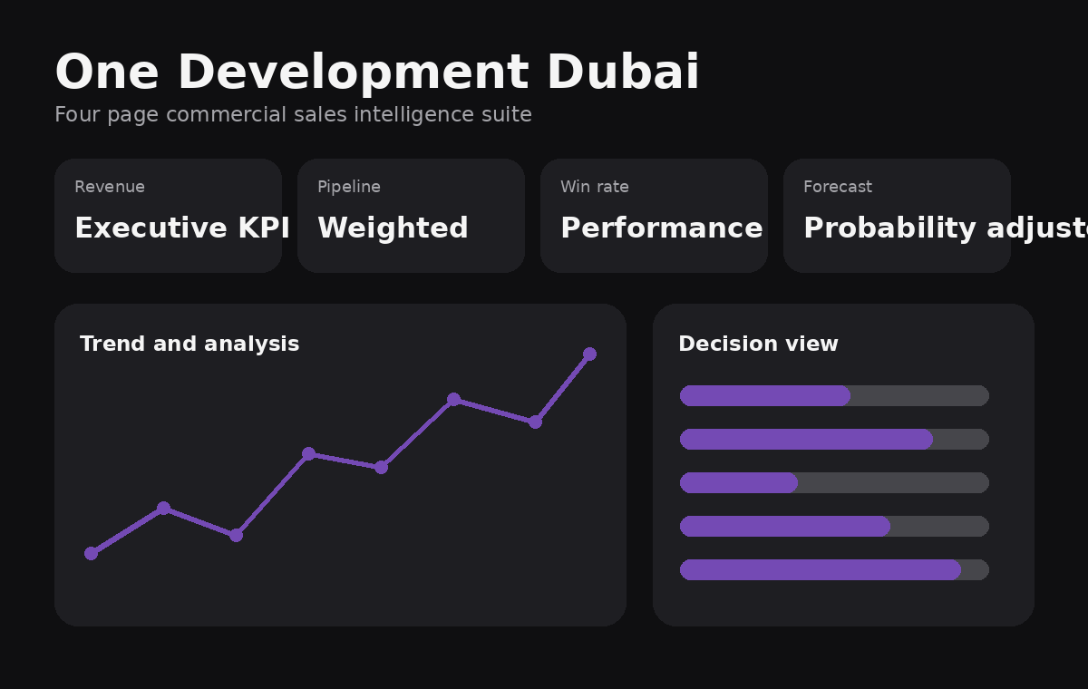
One Development Dubai preview: executive KPIs, weighted pipeline, win rate and forecast organised for commercial investigation.
Outcome honesty: the portfolio can show the artefacts and the decisions they were designed to support. I do not claim a quantified business impact unless I can evidence it.
Data product practice
A dashboard is an interface, not the analysis.
I treat the requested KPI as the starting point, not the finish line. The analytical job is to establish whether the underlying data can be trusted, compare behaviour against useful baselines, segment the pattern, notice what is not already being measured and then design the output around the decision the stakeholder needs to make.
The product design layer begins when choosing how that reasoning is exposed. I spend time on filter logic, reading order, chart choice, labels, density and progressive detail because a correct result can still fail if the person using it cannot understand what matters or where to look next.
NHS cost and claims dashboard case study
This healthcare focused Power BI model brings financial trend analysis, claims activity and demographic context into a single reporting view. The report structure includes a yearly cost visual combining total cost with year on year movement, a cumulative cost trend, claims by day, refresh date visibility, gender composition, claim type distribution and year filtering.
The design intent is to let a user move quickly from the headline question, what is changing in cost?, into operational context such as when claims occur and how the case mix is distributed. The underlying model also includes dedicated measures for total cost, year on year cost, cumulative cost and claims per day, which separates reusable business logic from the visuals themselves.
Power BI file
Inspect the actual report model
The PBIX contains the report structure and measures described above and can be opened directly in Power BI Desktop.
Download NHS Power BI fileOne Development Dubai sales intelligence case study
This is a four page commercial dashboard designed around the journey from executive visibility to sales action. The Executive Overview surfaces total revenue, weighted pipeline, win rate, quarter on quarter revenue, open pipeline, product contribution and a revenue trend against a three month rolling average. Slicers allow the user to move by year, manager and sector rather than treating the report as a static presentation.
The Pipeline and Forecast page separates raw open opportunity value from probability adjusted pipeline, allowing decision makers to distinguish ambition from realistic forecast. The Sales Team Performance page adds agent level measures, deals won and lost, win rate, average deal size, open pipeline and revenue rank. The final Accounts and Industry view examines revenue contribution by sector and regional sales effectiveness using deal size, revenue, win rate and pipeline together.
The result is a reporting system with different levels of decision making built into the same model: senior leadership can scan headline commercial health, while managers can drill into pipeline quality, team performance and sector concentration.
Power BI file
Inspect the One Development report
Download the PBIX to explore the report structure, measures and pages directly in Power BI Desktop.
Download One Development Power BI fileProfessional practice
Where data engineering became product thinking.
Motor Insurers' Bureau
I spent much of the role building and maintaining ETL pipelines in Azure and cloud environments. That exposed an upstream usability problem: inconsistent validation at data entry created errors that had to be repaired later. Once the pipelines were reliable, I used the resulting data in dashboards and focused heavily on filter behaviour, clarity and reducing the effort required for internal users to investigate issues.
Prevail Partners
For senior and government facing audiences, visualisation was not a cosmetic final step. I considered who would consume the intelligence, how much information they could scan quickly and which visual forms would communicate relationships most clearly. I used stakeholder conversations and context to choose between formats such as bars, maps and bubble views rather than defaulting to the same chart for every question.
NTT DATA · ScottishPower
My digital analytics work crossed directly into experience design. On ScottishPower content around COP, I considered how page structure could earn attention before asking users to absorb dense information, including using a carousel and progressive content to create a more inviting route into the subject rather than presenting a wall of explanatory copy.
The recurring skill
Across all three roles, the pattern was the same: understand where information comes from, identify where the current system creates friction or hides meaning, and redesign the path so the next person can reach the answer faster and with more confidence.