Several everyday banking moments create uncertainty: maintenance, transaction context, recurring payments and credit card comprehension.
Product Design · UX Strategy · Mobile Banking
Barclays Better Everyday Banking
An 18 screen concept exploring how a familiar banking app could become more resilient during maintenance, more useful after a transaction and easier to understand for customers learning credit for the first time.
At a glance
Turned five friction areas into four connected jobs, prioritised the riskiest assumptions, narrowed the MVP and built an 18 screen connected prototype.
Independent Alpha concept. Current evidence is interface observation and product reasoning; customer research, technical constraints and measured outcomes are proposed next steps.
Current stage
Alpha, deliberately.
I use Discovery → Alpha → Beta → Live to make maturity explicit, but I have kept the full lifecycle explainer on the Lloyds case study rather than repeating the same framework here. This work is currently Alpha: a set of testable product hypotheses and an 18 screen prototype, not a delivered Barclays feature.
Before
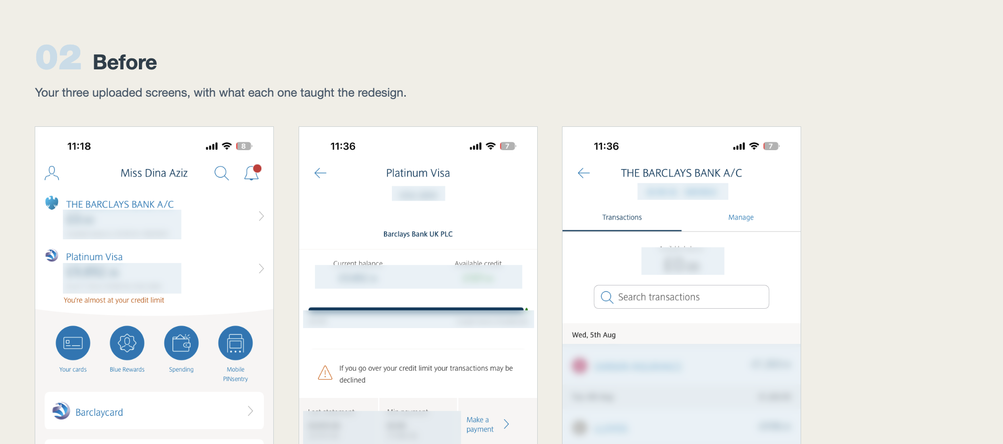
The existing Barclays experience was the starting point, not something to erase.
I used the current Accounts Home, Platinum Visa and Bank Account transaction screens as the baseline. Keeping these references visible made it easier to judge whether each concept change solved a real point of friction while still feeling recognisably Barclays.
Problem space
Functional banking can still leave people guessing.
I rewrote each friction as a Jobs to be Done question instead of jumping straight to a component: when the bank is unavailable, help me understand what information I can still rely on; when I revisit money movement, help me recover the context; when recurring or credit information is complex, help me understand what happens next without translating banking language myself.
Who this is for
Two behaviours, not one generic banking persona.
Dina, 28 · junior professional
Recently moved from a basic current account to a Barclays Platinum Visa. She banks entirely on mobile, checks her balance several times a week and tracks spending mostly in her head.
- Two Barclays products
- First credit card
- Confused by positive signs on card transactions
- Does not know when the balance transfer offer ends
The customer who opens the app during maintenance
Someone travelling at 2am needs to confirm what they can afford before paying for accommodation. They cannot wait until morning for systems to return.
- Needs useful information now
- Can tolerate cached data if freshness is explicit
- Needs navigation to continue working
- Needs certainty about what is live and what is not
Research status: these are design hypotheses and scenarios for the concept. They should be validated with real Barclays customers rather than presented as completed customer research.
Framing the brief
The questions I would take into discovery.
Those questions would shape interviews, analytics review and contact centre analysis. I would synthesise the research into behaviour patterns and needs, not personas first, then write a small set of problem statements the team could challenge together.
What does the current Barclays app already do well that should be preserved?
Which customer complaints create the most uncertainty or avoidable support contact?
What belongs in a six month engineering roadmap versus a later phase?
Which concepts could realistically reduce contact centre demand?
Where does copy need regulatory caution, especially around future payment dates?
Which pieces require live merchant data, secure APIs or infrastructure changes rather than just interface work?
The opportunity is broader than adding four convenient features. It is reducing moments where customers cannot tell what is happening, what information is current or what action to take next. I would use assumption mapping to rank beliefs by uncertainty and consequence: for example, whether cached balances are reassuring or misleading during maintenance is a much riskier assumption than whether a tag control belongs above or below a note field.
User need → problem → hypothesis → test
The existing app provided the service context. Maintenance states, transaction references, recurring money and credit card terminology generated specific design questions, while my own experience helped identify where those questions deserved investigation.
Customers experience avoidable uncertainty across these moments and clearer status, context and explanation would reduce cognitive effort without requiring a wholesale redesign.
If Barclays preserves familiar navigation while making system status, transaction meaning, recurring money and card information easier to interpret, customers will complete common tasks with more confidence and less need to leave the app for clarification.
Validate the problem frequency first, then test maintenance comprehension, transaction recognition, recurring payment discovery and credit card understanding as separate tasks. A feature only earns the roadmap if it changes behaviour or comprehension, not merely preference.
Impact mapping
I mapped the outcome before the feature.
The impact map keeps the deliverable provisional. The theory of change is that clearer status and context should reduce uncertainty; lower uncertainty should improve decision confidence; and better confidence should reduce unnecessary recovery and support effort. That chain is more useful than asking whether people simply like the screens.
Low fidelity before visual polish
I kept the fidelity low until the structure had earned the pixels.
Journey mapping showed what the customer is trying to understand at each moment; a service blueprint then linked those front stage interactions to system status, cached data, transaction services, card security and support dependencies behind them. That exposed where a nice interface could accidentally promise something the underlying service cannot guarantee.
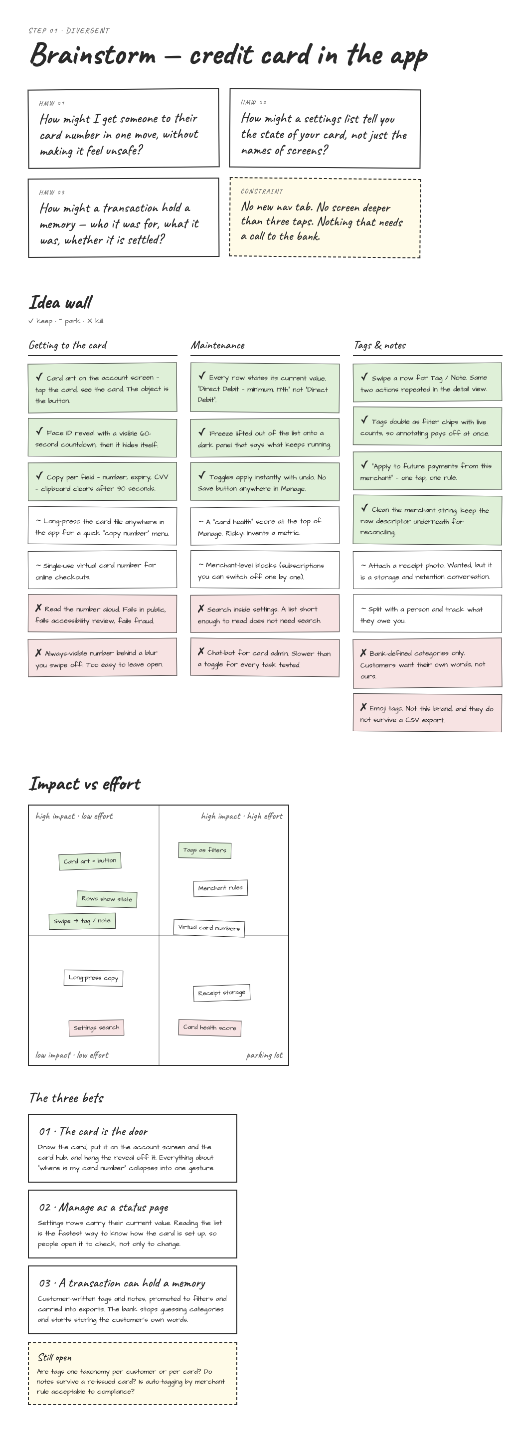
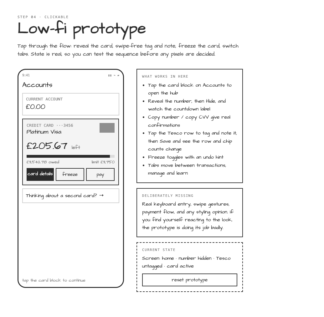
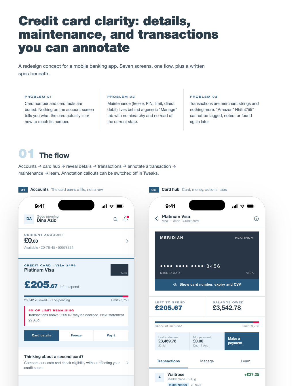
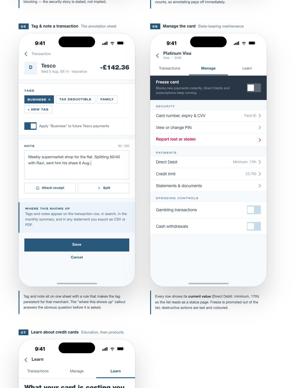
The exploration started with constraints and behavioural questions rather than a visual redesign. I mapped three core bets: make the card itself the gateway to card management, treat Manage as a status page rather than a settings graveyard, and let a transaction hold the customer's own memory without altering the official banking record.
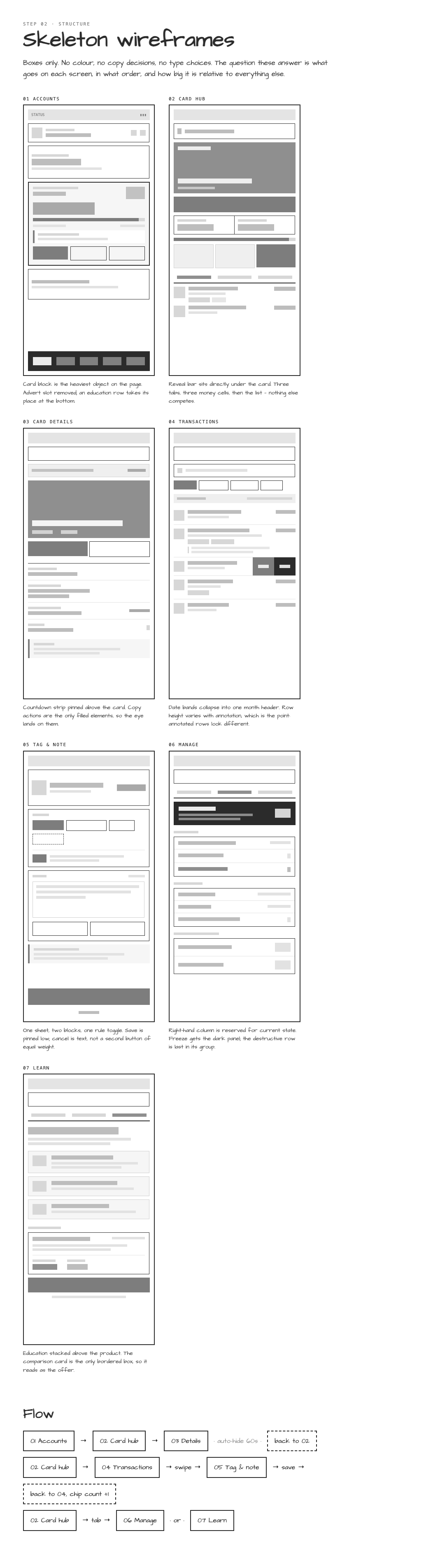
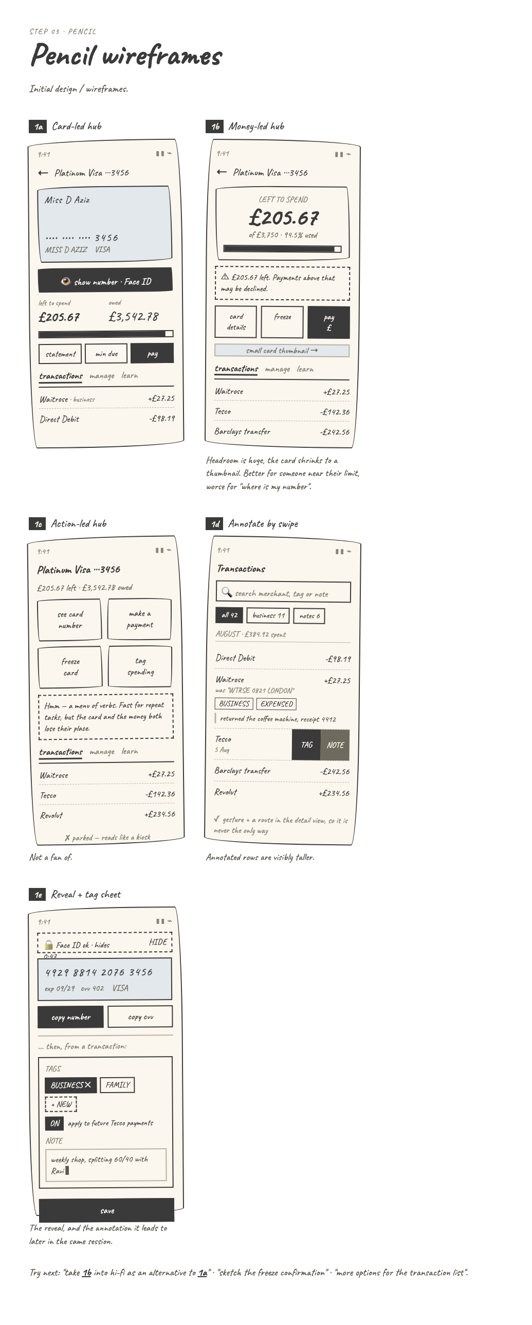
The flow then moved through skeleton wireframes, pencil alternatives and a clickable low fidelity prototype before applying the Barclays visual language. The point of each stage was to answer a different question before adding polish.
Prioritisation
What made the prototype, and what I deliberately left out.
Final cut
Graceful maintenanceKeep cached balances and transaction history available, with clear freshness messaging.
Transaction notes and tagsA relatively contained feature with high personal finance value and no need to alter the official banking record.
Recurring payment visibilityMake frequency, previous payments and expected timing easier to understand.
Direct Debit overviewTurn scattered recurring payments into one audit view.
Credit card literacyExplain positive signs, credit limits, minimum payments and balance terminology in context.
Offer end datesSurface promotional windows where the customer already manages the card.
Biometric card revealKeep sensitive card information protected while matching a familiar mobile pattern.
Salary detailTreat the most emotionally significant incoming payment as more than a generic merchant row.
Deprioritised
Automatic budgeting categoriesToo much machine learning complexity for the purpose of this prototype.
Live merchant logosWould require third party data agreements, so the concept uses letter avatars.
Credit limit push alertsA useful feature, but outside the in app screen scope.
Split billPotentially valuable for younger users, but large enough to deserve its own design sprint.
MoSCoW forced a harder question than “is this useful?”: does it earn a place in the first viable service? Clear status, freshness and safe card access are essential. Notes and recurring payment context matter but can follow. Education and richer personalisation only belong once the core service is understandable and trustworthy.
MoSCoW helped decide what earns its place.
For Barclays, prioritisation meant protecting the moments that reduce uncertainty first: knowing what is current, understanding a transaction, seeing recurring commitments and accessing card information safely. Enhancements only earn space once those core jobs are clear and technically supportable.
Clear service status during maintenance, explicit data freshness, safe card detail reveal, understandable balances and transaction information that never implies certainty the bank does not have.
Recurring payment visibility, transaction notes and tags, clearer promotional dates and contextual education for first time or less confident credit customers.
Deeper personalisation, predictive prompts and broader learning content after the core tasks are validated.
A wholesale Barclays redesign, invented real time certainty during outages, guaranteed future payment dates, or automatic changes to official transaction records.
The 18 screen system
Four connected jobs rather than eighteen isolated mockups.
Stay useful during maintenance
Home, transactions and statements degrade gracefully. Cached data remains available with timestamps, red maintenance banners and amber freshness notices.
Remember what a payment was
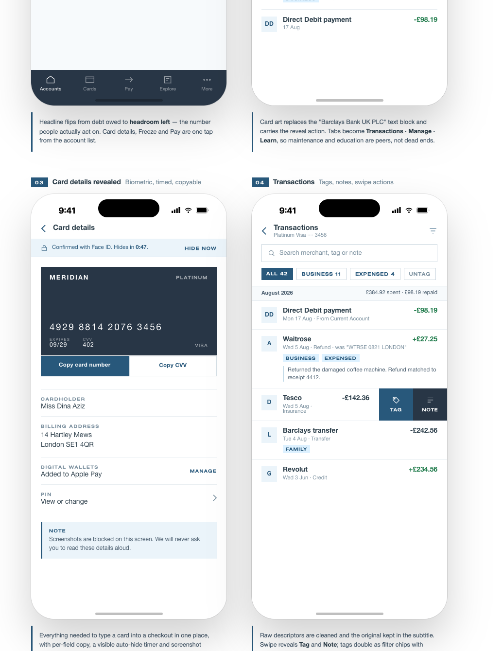
Transaction details separate official bank information from private notes, tags and passive merchant recognition suggestions.
Understand recurring money
Direct Debit detail shows prior payments, frequency and an expected next date using careful language such as “Around 12 September”.
Understand the credit card
The card journey brings together balance, available credit, credit limit, offer end dates, secure card details and contextual FAQ content.
A realistic delivery plan
How I would structure a four month concept validation cycle.
This timeline is a proposed project plan for a cross functional banking team, not a claim that the research and stakeholder activities below have already taken place.
Discovery and definition
Stakeholder alignment, analytics and contact centre review, legal considerations, six qualitative customer interviews, competitor audit and feature prioritisation.
Weeks 1 to 4UX and design
Information architecture, card sorting, low fidelity exploration, design system application and prototype review with product, engineering and compliance.
Weeks 5 to 8Build and test
Engineering handoff, core and secondary screen build, navigation logic, maintenance states and a full QA pass across transactions, cards and signs.
Weeks 9 to 12Iteration and handoff
Usability testing, copy iteration, accessibility review, final specifications and production implementation planning.
Weeks 13 to 16Production realityThe prototype is the cheap place to answer expensive questions.
A production implementation would extend beyond the concept cycle because maintenance resilience, cached data, APIs, secure card infrastructure, phased feature flags and regulated rollout all require significant engineering work.
Validation plan
What I would actually test with customers.
I would turn each risky assumption into a hypothesis before usability testing, with an expected behaviour and an explicit failure condition. For maintenance, for example: if cached information is clearly timestamped, customers should be able to tell what is safe to rely on without assuming the balance is live. Testing would measure comprehension as well as task completion.
Can a first time cardholder explain what a positive card transaction means?Tests whether the FAQ and transaction direction cues close the literacy gap.
Can someone tell how fresh maintenance data is?Tests whether cached information creates confidence rather than false certainty.
Can customers find card details without trying Manage first?Tests discoverability of the card management entry point.
Do notes and tags feel useful enough to justify the effort?Tests whether annotation becomes durable value or additional admin.
Does “Around 12 September” communicate uncertainty clearly?Tests comprehension of expected Direct Debit timing without implying a guaranteed date.
Can customers distinguish official transaction data from their own annotations?Tests trust and record integrity.
Accessibility is part of whether the banking task works at all. I would target WCAG 2.2 AA and test keyboard access, visible focus, screen reader announcements, contrast, zoom, error handling and the secure reveal interactions with assistive technology.
Status without colour.Maintenance, cached information, frozen cards and warning states need text labels in addition to colour or icon changes.
Secure reveal.Card number reveal and copy actions need clear accessible names, predictable focus behaviour and confirmation that does not rely on animation alone.
Financial language.Balance, available credit, promotional dates and expected payments should use plain language without removing legally or financially important meaning.
Responsive text.Dense financial information must remain understandable at larger text sizes without clipping, hidden actions or ambiguous truncation.
Banking interfaces have to work under pressure.
Maintenance status, incoming transactions and limit warnings should never rely on colour alone.
Interactive rows, card actions and accordion controls should meet a minimum 44 by 44 point target.
Merchant avatars, icon only actions and sign conventions need descriptive labels rather than visual shorthand.
Full card details should remain hidden until explicit authentication and hide again when the user leaves the secure state.
Constraints and safeguards
The interface cannot promise more certainty than the banking system has.
Cached data must look cached
During maintenance, balances and transactions remain visible only with explicit timestamps and notices explaining that newer activity may not yet appear.
Personal notes stay separate
Customer annotations are private context. They should never visually replace or modify the official transaction description held by the bank.
Expected is not guaranteed
Recurring payment copy uses language such as “Around 12 September” because the bank should not imply a future Direct Debit amount or date is certain when it is not.
Card data requires deliberate reveal
Full card number, expiry and security code sit behind biometric or passcode verification and hide again when the secure state ends.
Success measures
What would tell me the design is actually helping.
I would not judge the concept by screen engagement alone. The stronger signals are whether customers understand their money more quickly and need less recovery or support effort.
Maintenance comprehensionCan customers correctly state how old the visible balance is?
Transaction recognitionReduction in time spent identifying unfamiliar payments after notes, tags or merchant context are available.
Credit literacyPercentage of first time card users who can correctly explain positive and negative transaction signs, available credit and minimum payment.
Recurring payment clarityTask success when finding what was paid last, what is typical and when the next Direct Debit is expected.
Support deflectionChange in contact centre queries linked to transaction recognition and basic credit card mechanics.
Annotation valueWhether customers return to notes and tags later, rather than simply creating them once.
What this prototype proves
A shared reference before expensive implementation.
This is concept validation, not production banking software. Its job is to show that the proposed flows can live together coherently, that the Barclays visual language can carry them and that product, engineering and design can discuss the same interaction before infrastructure work begins.
18connected screens
4core customer jobs
1working prototype
Interactive prototype
Explore the complete Barclays Better Everyday Banking concept, including maintenance states, transaction notes and tags, Direct Debit flows, credit card education and biometric card reveal.